Design
manual
GMMedia visual identity guidelines — logos, colours, typography and graphic elements for consistent communication.
Logotype





Usage rules, clearspace, minimum size and prohibited modifications are described in the detailed guide.
Logo usage rulesColour palette
The primary brand colour is Gold #C9A227. It is always used against a dark background — never on white without adaptation. Use Pantone values for print.
Gold
Primary / Accent
Black
Background
Cream
Primary text
Card Dark
Cards / Surfaces
Border
Borders / Dividers
Muted
Secondary text
Tonal scales, colour combination rules, UI element usage and colour space overview are described in the detailed guide.
Colour usage rulesTypeface
Typeface
Plus Jakarta
Sans
Aa Bb Cc Dd Ee Ff Gg Hh Ii
GMMedia develops voice AI assistants for automated phone communication. The technology works 24/7, with no waiting and instant response.
Aa
400
Regular
Body text, labels, meta info
Aa
600
SemiBold
Emphasis in text, buttons, navigation
Aa
700
Bold
H3–H4 headings, badge texts
Aa
800
ExtraBold
Main H1–H2 headings, hero titles
Rules
- → Headings: font-display (ExtraBold 800)
- → Body text: font-body (Regular 400)
- → Navigation, buttons: uppercase + letter-spacing
- → Never use italic for UI elements
Brand name spelling
The brand name has precise rules. Always use one of the approved variants — especially in print, presentations and on the web.
Legal company name
In legal documents, contracts and invoices always use the exact registered name: GM Media s.r.o.
Visual elements
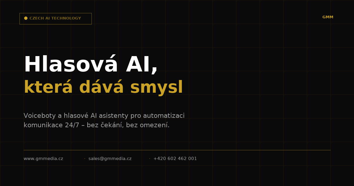
The GMMedia graphic system is built on the contrast of dark and gold, sharp geometric shapes, and a network pattern symbolising connectivity and technology.
Network Overlay
Network pattern — used as hero section background and decorative element. Always low opacity (20–60%).
Sharp corners
No rounded corners (border-radius: 0–2px). Geometric precision reflects the technical precision of AI.
Gold line
Gold line as a section divider. Gradient version for hero, solid for card separators.
Animated Border
Rotating gold gradient border — used to highlight key UI elements and demo blocks.
Badge / Label
Small typographic labels for marking sections. Gold variant with pulsing dot indicator.
Dark
+ Gold
Dark + gold contrast
The core visual principle — maximum contrast between a dark background and a gold accent creates a premium effect.
Print materials
Corporate templates for print and digital communication. When editing, maintain the defined colours, typeface and element layout.